Role
Associate UX/UI Designer
Timeline
2 years
Team
3-4 people
Platform
Web application — desktop & mobile

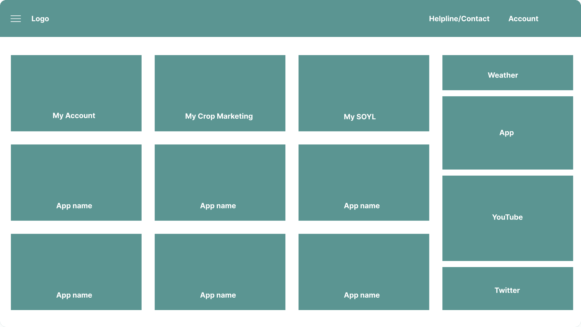
MyFarm home screen redesign — core modules accessible from a single entry point.
The Impact
Clarity for the office.
Access for the field.
The redesign replaced an inconsistent, desktop-heavy experience with a system built around clear visual hierarchy and purposeful information grouping.
Farmers using the platform on mobile in the field could now check grain prices, track contracts, and view account activity without switching between tools.
Pricing data and account views that previously lived in separate systems were unified into one platform, reducing the time users spent locating critical information before transactions.
MyFarm home screen wireframe (AS-IS)
Problem
MyFarm had expanded to cover four distinct tools — Dashboard, Account, Crop Marketing, and Calculator; each had evolved independently. The result was an inconsistent interface with siloed data, no coherent mobile experience, and workflows that pushed users back to spreadsheets and phone calls to fill the gaps.
01
Fragmented data across tools
Prices, contracts, and account data lived in separate systems — users had to cross-reference multiple places to make a single decision.
02
Manual, paper-based workflows
Contracts were tracked in spreadsheets and sent by post. Grain collection confirmations had no digital trail.
03
Poor mobile access in the field
The existing platform wasn’t mobile-first — farmers on the farm couldn’t use it effectively when it mattered most.


Validated pain points from discovery workshops with Frontier’s product and BA teams.
Research
Research centred on two distinct user segments: grain traders who work primarily at a desk managing contracts and price negotiations, and traditional farmers who handle both administration and physical farm operations. We mapped their journeys through buying, selling, and collection workflows to surface where the current tools broke down.


Farmer and farm trader personas — capturing the goals, frustrations, and tool mix of a traditional farm owner.
What we learned
Both George Williams (Farm Trader) and Rob Smith (Traditional Farmer) relied on multiple unconnected tools to do a single task — BBC Weather for forecasting, Microsoft Excel for stock tracking, and separate platforms for price checking before any transaction. The common thread was low confidence in digital tools: if an app slowed down or required too many steps, users fell back to pen and paper immediately.
“I need to check the current price and my stock position before I decide to sell — but those are in two completely different places. By the time I’ve found everything, the moment’s passed.”
George Williams
Farm Trader — composite persona


Journey map across the buy/sell cycle — low points at collection tracking and decision-making steps drove the core feature priorities.
Ideation
We used a feature-mapping exercise to sort requirements by priority — separating what farmers needed at launch from what could wait. This kept the team focused on mobile-first core flows (order tracking, price checking, account switching) before investing in more complex features like region-specific data exports.

Feature mapping session output — “effective order tracking” and “mobile-first alerts” defined the first design sprint.
Testing interaction flows early
Wireframes were sketched and brought directly into stakeholder workshops, where the product owner and business analyst could review and approve interaction flows on the spot. This replaced a review cycle that had previously taken weeks — sign-offs that used to require multiple separate meetings were resolved within a single session.
The discover → define → design → deliver structure kept each sprint grounded in validated problems rather than assumed requirements, and it gave the wider team clear checkpoints to flag issues before they became costly to undo.

Four-stage design process — each phase had a defined output and a stakeholder sign-off gate.
Designs
The final designs unified all six MyFarm modules under a single navigation system and consistent component library. Desktop and mobile layouts shared the same design language — the information hierarchy adapts to screen size, but the structure stays the same.

MyFarm Dashboard — Desktop view
MyFarm Dashboard — Phone view

MyAccount — Desktop view

MyCropMarketing — Desktop view
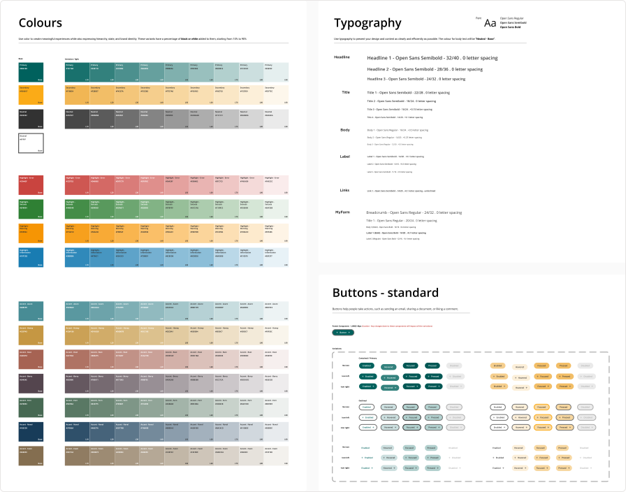
Design system — built from the ground up for web, replacing a print-origin style guide with web-native tokens, type scales, and reusable components.

Celebrating design: Delivering a seamless and delightful user journey that amplifies user satisfaction and engagement.

Lessons
Getting stakeholder alignment on requirements took nearly three months which is longer than any design sprint. That taught me that the hard part of an enterprise design project isn’t the interface; it’s building the conditions where decisions can actually be made. Frequent short reviews, held in the room with the right people, consistently outperformed any amount of polished documentation.
Inheriting a design language built for print was the most instructive constraint of the project. It forced me to think carefully about the difference between brand consistency and web-native design and to build a system that could be extended by developers without ambiguity, rather than interpreted each time from a PDF.